| Scatter Plots | Regression |
| Correlation | Using Graphing Calculator to Get Line of Best Fit |
Usually around the time that you are beginning “Algebra II” you’ll have another lesson on a little more advanced Statistics than you had earlier (in the Introduction to Statistics and Probability section). These include Scatter Plots, Correlation, and Regression, including how to use the Graphing Calculator.
Scatter Plots
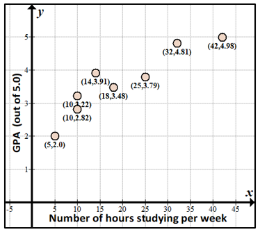
In the real world, there are always sets of data that need to be interpreted. As an example of interpreting sets of data, we may want to see if there is some sort of connection between two sets of data, such as the number of hours studied per week versus grade point average. It seems like the two variables would be related, but suppose you survey some of your friends to see what a graph would look like:
|
Friend |
Number of hours of studying per week |
Grade Point Average (out of 5.0) |
| Allie | 14 | 3.91 |
| Samantha | 42 | 4.98 |
| Hayley | 10 | 3.22 |
| Jessica | 32 | 4.81 |
| Megan | 5 | 2.0 |
| Rachel | 10 | 2.82 |
| Briley | 25 | 3.79 |
|
Lauren |
18 |
3.48 |
To make more sense of the data, let’s first order it by the number of hours of studying:
| Friend | Number of hours of studying per week | Grade Point Average (out of 5.0) |
| Megan | 5 | 2.0 |
| Hayley | 10 | 3.22 |
| Rachel | 10 | 2.82 |
| Allie | 14 | 3.91 |
| Lauren | 18 | 3.48 |
| Briley | 25 | 3.79 |
| Jessica | 32 | 4.81 |
| Samantha | 42 | 4.98 |
Here’s what the scatter plot looks like. A scatter plot is just a graph of the $ x$-points (number of hours studying each week) and the $ y$-points (grade point average):
Correlation
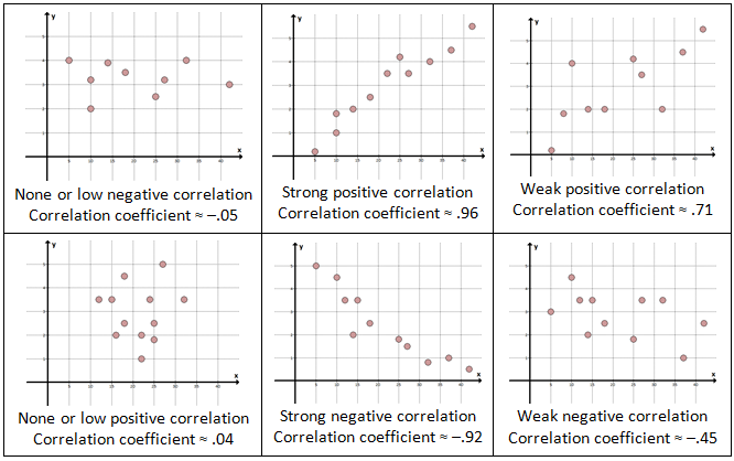
Notice from the scatter plot above, generally speaking, the friends who study more per week have higher GPAs. Thus, if we were to try to fit a line through the points, which is a statistical calculation that finds the “closest” line to the points, it would have a positive slope. Since the trend is that when the $ x$-values go up, the $ y$-values also go up, we call this a positive correlation, and the correlation coefficient is positive.
Note that a positive correlation doesn’t necessarily mean that the effect of one variable causes the effect on the other variable (a causal relationship, or causation); there may be a third effect that causes both of the variables to make the same type of changes. For example, there seems to be a strong correlation between shark attacks and ice cream sales; of course shark attacks do not cause people to buy ice cream, but in hot weather, both shark attacks and people buying ice cream are more likely to occur.
Again, correlation can be thought of as the degree in which two things relate to each other, and the correlation coefficients are anywhere from –1 (strong negative correlation) to 1 (strong positive correlation). A correlation coefficient of or near 0 means there’s no connection at all between the two variables.
Here are some examples (“≈” symbol means approximately equal to):
Regression
Going back to our original data, we can try to fit a line through the points that we have; this is called a “trend line”, “linear regression” or “line of best fit”; it’s the line that’s the “closest fit” to the points – the best trend line. The formula for getting this line is a bit complicated (the “least squares method”, if you’ve heard of it) and is learned in more advanced Statistics, but you may learn how to do with a graphing calculator, as shown below.
Here’s what the line looks like through our data:
| Graph | Notes |
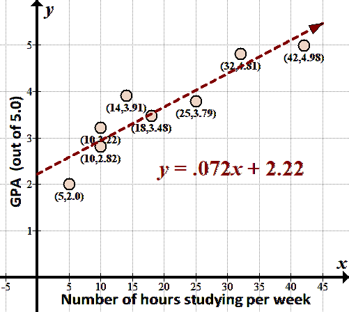 |
The “best fit” trend line is $ \displaystyle y=0.072x+2.22$.
We can use this trend line to predict other points on the line.
We’ll learn how to get this line, given the eight points that we have, with a graphing calculator. |
Using Graphing Calculator to Get Line of Best Fit
You can put the data in the graphing calculator and have the points graphed, and also get the equation for the best fit trend line. You can then graph this line over the points like we see above. (I’m using the TI-84 Plus CE calculator.) 
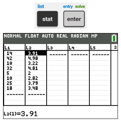
To do this, first put the data points in “lists” in the calculator:
| Keystroke | Screens |
| Push STAT, then ENTER to go to EDIT.
To clear anything in the lists L1 or L2, move cursor to the top to cover the L1 or L2 and hit CLEAR (not DEL) and then hit ENTER.
To type in the data, start with right under the L1 and separate each entry by ENTER or by moving the cursor. The $ x$’s go under L1 and the $ y$’s go under L2.
If you need to edit the entries, you can access the lists the same way. You can type 2nd MODE (QUIT) to quit when you are done. |
 |
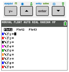
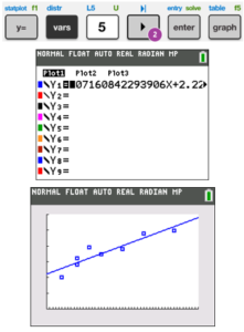
| To have the calculator plot the points in L1 and L2, after pressing Y=, move cursor up to Plot1, and hit ENTER. It should be highlighted as seen. Make sure everything is cleared out of the Y= fields.
(You can also push 2nd Y= (STAT PLOTS), ENTER, ENTER to turn on Plot1, and 2nd MODE (QUIT) to exit. You can turn off Plot1 either way.) |
 |
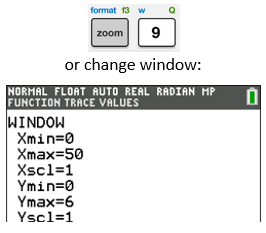
| If you need to, change the window you see by pushing “ZOOM 9” (ZoomStat).
You can also change the window by pushing WINDOW. Scroll down to enter the Xmin, Xmax, Ymin, and Ymax values by looking at the data and choosing appropriate values (look at the lowest and highest $ x$- and $ y$-values and add a little at both ends). |
 |
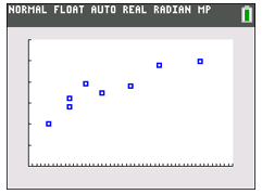
| Push GRAPH, and you should see the points plotted as shown.
To get out of the GRAPH mode, you can hit 2nd MODE (QUIT), or just press some numbers to use the calculator. |
 |
Now, let’s use the power of the graphing calculator to find the line of best fit for this set of data. Again, we could do this manually using a complicated formula in Statistics, but the calculator does it so easily! Basically, the math behind finding the best fit is finding a line that has the minimal distances to each of the points.
Basic Stats on Data from Calculator
Before I show you how to get the line of best fit, let’s get some simple data on the two sets of data – like the mean, median, quartiles, and max (that we got by hand for our Box and Whisker Plot in the Introduction to Statistics and Probability section). For our set of data, since we have two sets of data in our lists, we can use either 1-Var Stats or 2-Var Stats to get information about just the first set of data we put in L1, or both sets of data that we put in L1 and L2:
| Keystroke | Screens |
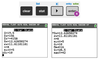
| To get some basic statistics for the data entered in L1, push STAT, move cursor to CALC, and then push either 1 or hit ENTER to get 1-Var Stats.
With the newer calculators, there’s a setting (default) to have STAT WIZARD: ON by hitting mode, which gives you the ability to enter more data when doing the STAT tests. Just keep hitting ENTER until you see the 1-Var Stats screen.
The $ x$ with the bar over it ($ \bar{x}$) is the mean. Other values that you may learn later in a Statistics class: $ \Sigma \,x$ is the sum of all the values in L1, $ \Sigma \,{{x}^{2}}$ is the sum of the squares of the values, $ Sx$ is the sample standard deviation, and $ \sigma x$ is the population standard deviation. When you scroll down from the first page of data, you’ll see the first Quartile, Median, third Quartile, and Max.
You can also use 2-Var Stats to get this data, plus data on the $ y$ values that you entered (into L2). |
 |
Line of Best Fit
Now let’s go back and do the regression of our data (find the line of best fit).
Note that before you do this, you should turn diagnostics on so you can see the correlation coefficient $ r$ and also $ {{r}^{2}}$ (which is the square of $ r$ and can used to compare linear and non-linear regressions to see which fits best). You can do this by hitting “mode” and scrolling down to STAT DIAGNOSTICS and hitting ENTER if it’s not on. (You can also go to 2nd 0 (CATALOG), then move cursor to DiagnosticOn and hit ENTER ENTER to turn this on). You can just keep this on and not worry about it.
Note that we show a quadratic regression here in the Introduction to Quadratics section, and an exponential regression here in the Exponential Functions section.
| Keystroke | Screens |
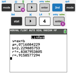
| First turn Diagnostics On per instructions above.
To get the best fit line for the $ x$- and $ y$-values that you’ve entered, push STAT, move cursor to CALC, and then push either 4, or move cursor down to LinReg(ax+b), and hit ENTER. Make sure you do this on a clean line in the calculator (not after numbers or anything). Keep hitting ENTER until you see the LinReg screen.
This will give us our $ a$ and $ b$ for the line $ y=ax+b$ ($ a$ is the slope, $ b$ is the $ y$-intercept).
The line of best fit is $ y=.0716x+2.23$, and our correlation coefficient $ \boldsymbol{r}$ is .916, which is close to 1 (meaning we have a good fit). |
 |
| To put this best fit line into the calculator, click on Y =, and then VARS, 5 for Statistics (or move cursor to Statistics), move cursor to right to EQ, then push ENTER. (You must have first used the LinReg(ax+b) function above.) You’ll see the Y1 filled with very long numbers (they don’t like to round on the calculator, I guess!)
Now push GRAPH to graph over the points that you have from the Plot1.
Note: You can also accomplish this by pushing STAT, over to CALC, scroll to LinReg(ax+b) ENTER or hit 4, scroll down to Store RegEQ, then (before hitting ENTER), pushing ALPHA TRACE (F4) 1, ENTER (for Y1), ENTER (OR after Store RegEQ, hit VARS, Y-VARS, 1 (Function), 1 (for Y1), ENTER, ENTER.) Now the equation will be in Y1, and you can graph it by hitting GRAPH.
(For the older operating system, or with STAT WIZARDS: OFF in mode, push STAT, CALC, scroll to LinReg(ax+b) or hit 4, then (before hitting ENTER), pushing VARS, Y-VARS, 1 (Function), 1 (for Y1), ENTER.) |
 |
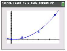
| You can also do the same steps with a quadratic equation (use QuadReg instead of LinReg) or even an exponential equation (ExpReg) (we’ll discuss these types of functions later). Here’s an example of a quadratic regression.
You’ll be able to choose which regression is best by both looking at the data, and looking at the value when you do the regression. |
 |
Learn these rules, and practice, practice, practice.
On to Exponents and Radicals in Algebra – you are ready!